WORLD PRESS PHOTO
Connecting the world with stories that matter.
Team
Lead Product designer (me), Strategist, Product owner, Project manager, Business analyst, Tech Lead, UX specialist, UX researcher, UX/UI designers, Content creators & Copywriter.
Insights from our design sprint.
How might we connect audiences around the world to the array of programs, events, projects and contests the foundation works on?
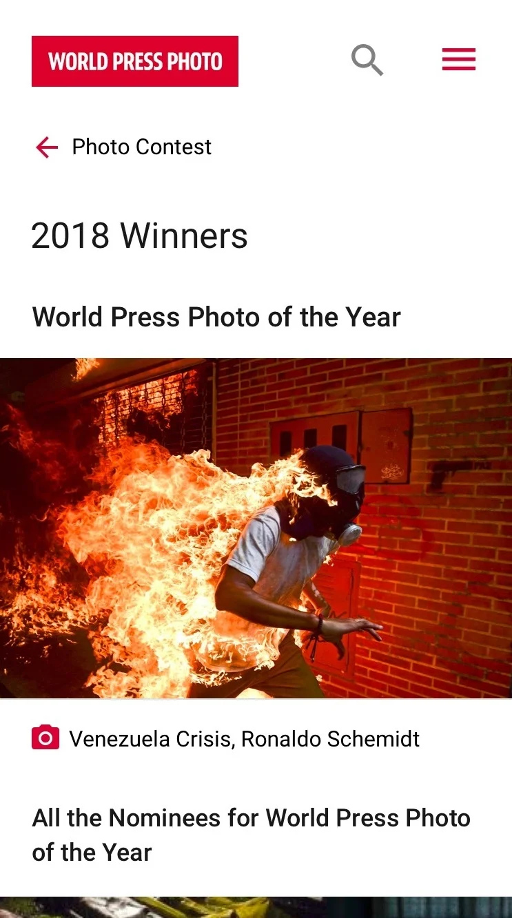
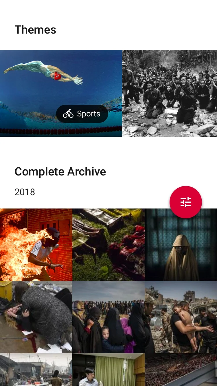
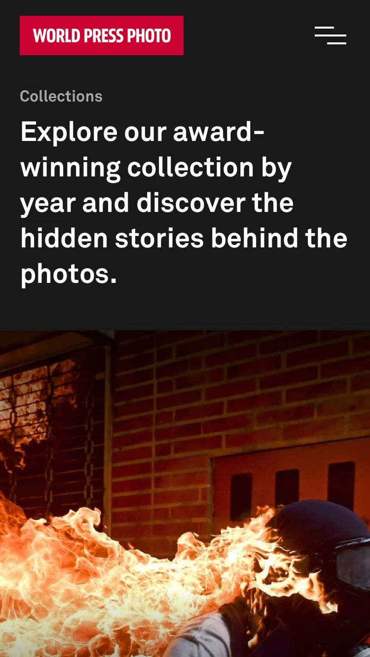
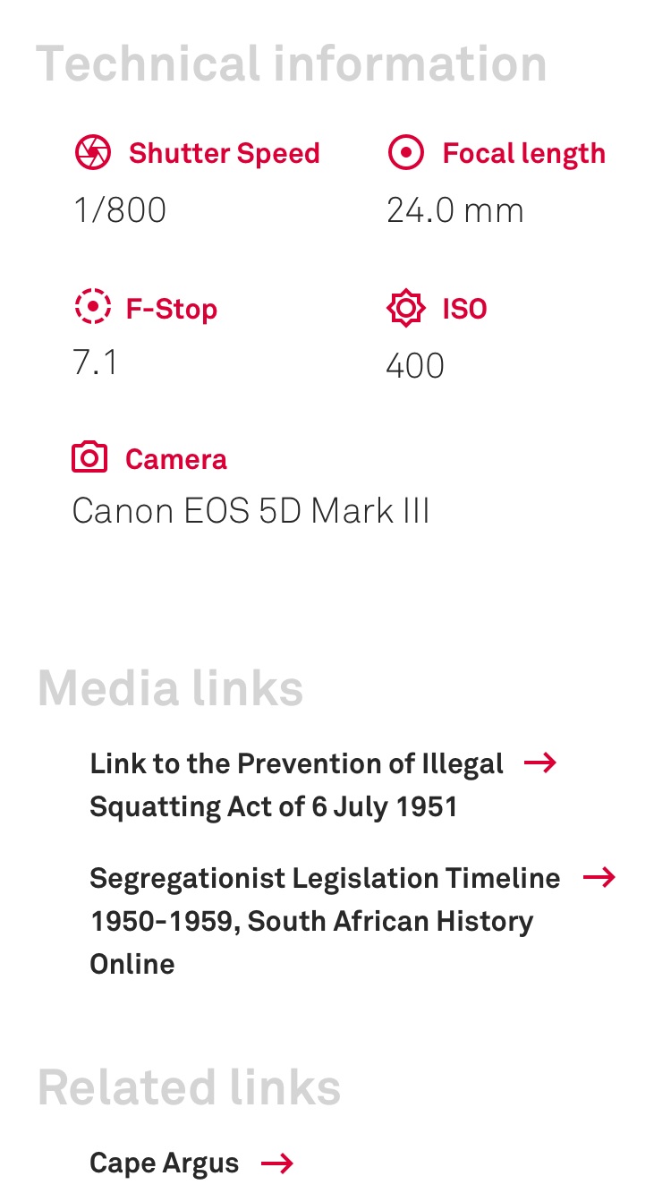
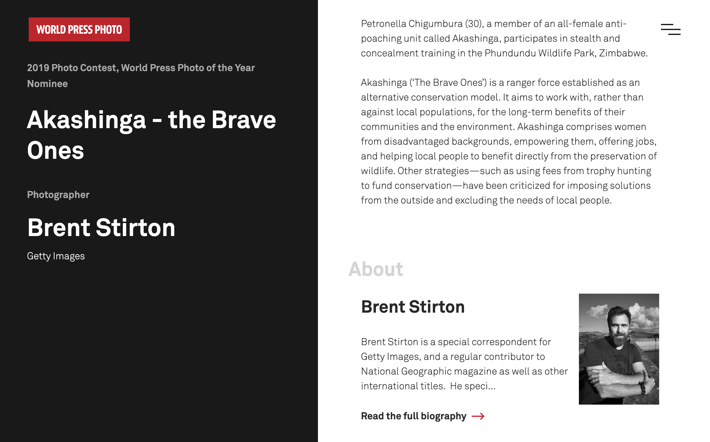
Archive pages to display all photos of the Year since beginning of contest.
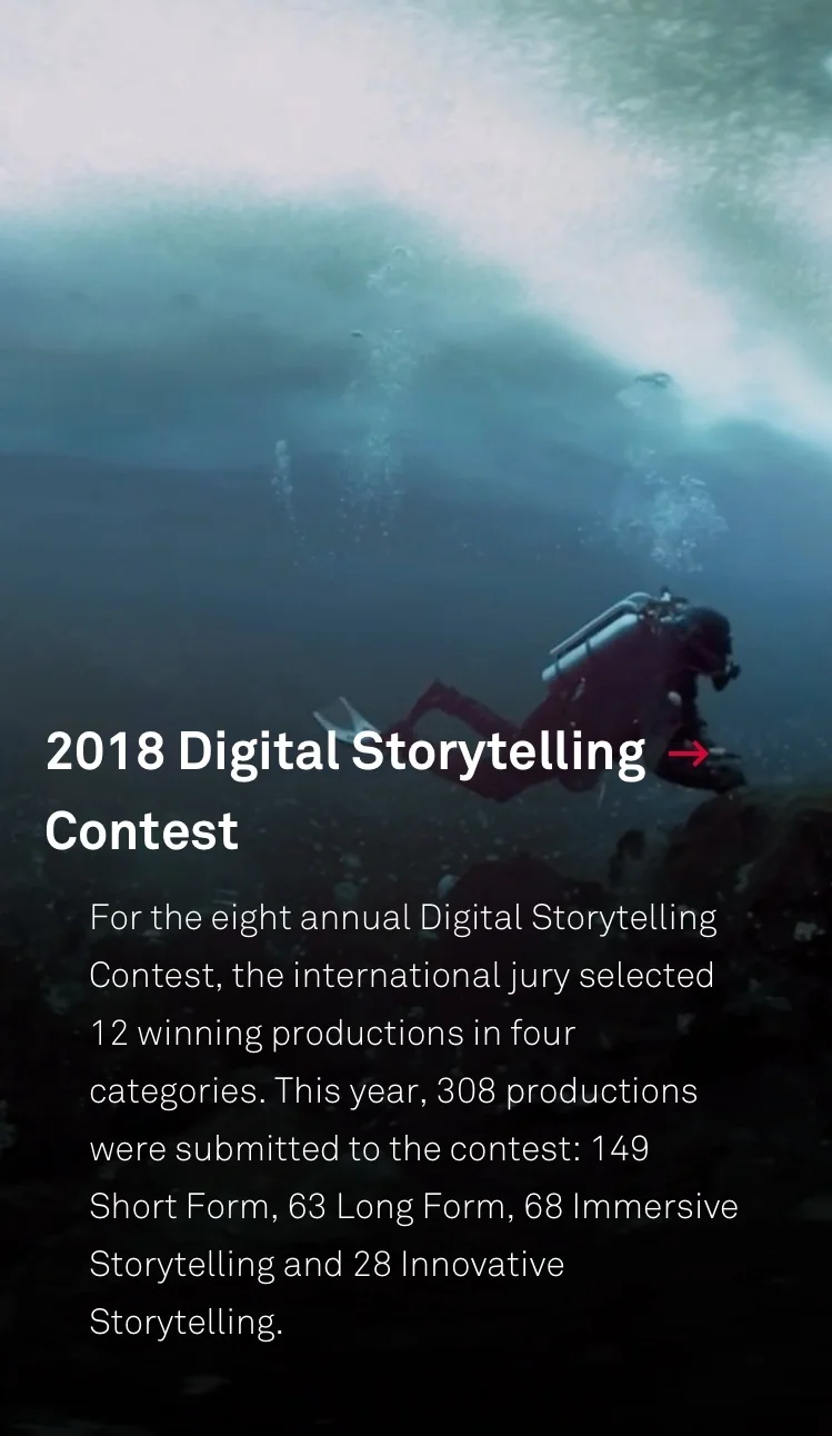
Galleries to simply display all kinds of photographic and video projects.
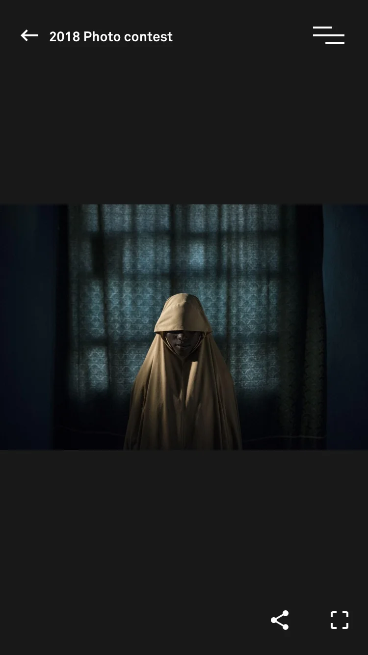
Documentary photography showcase focusing on different kinds of storytelling.
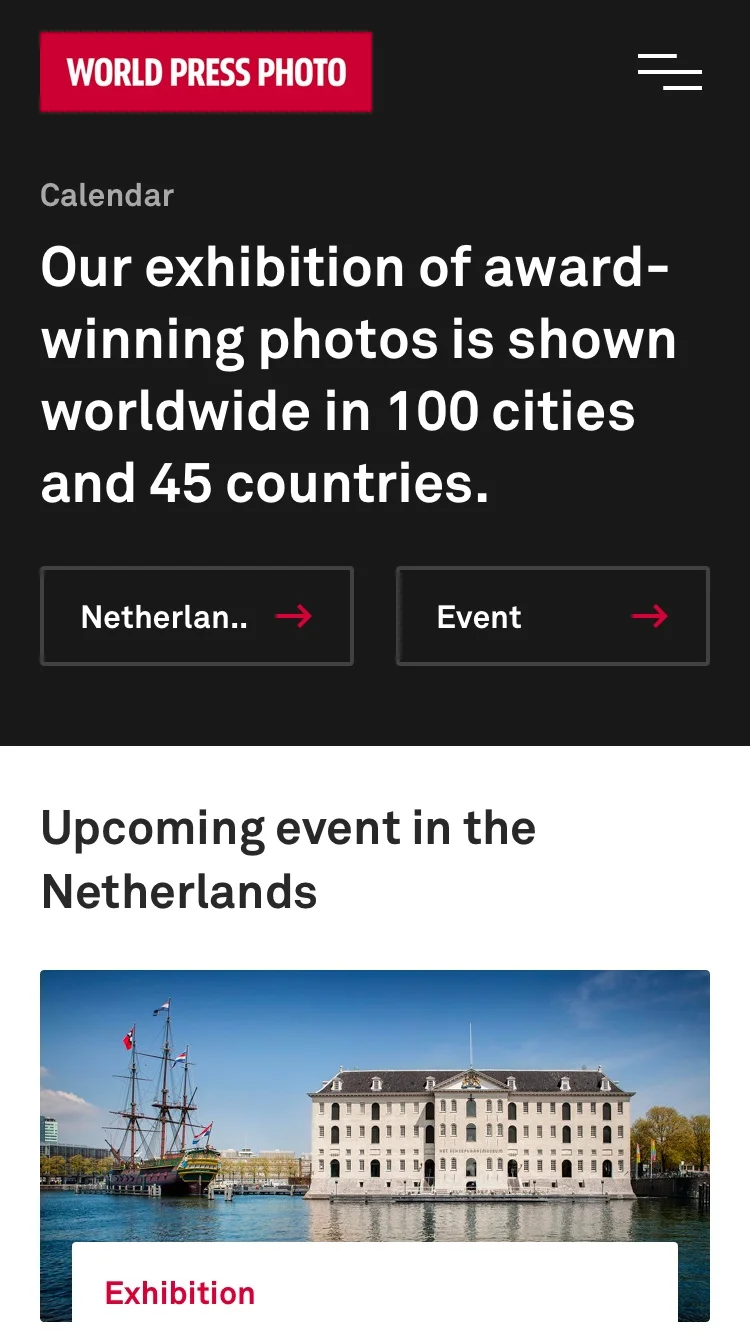
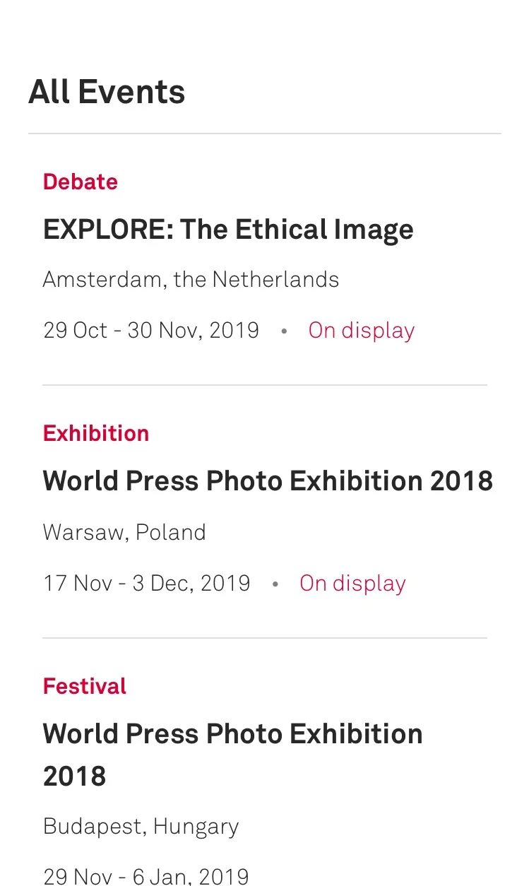
Personalisation: Display events in the local area, contests to professional photographers, etc.

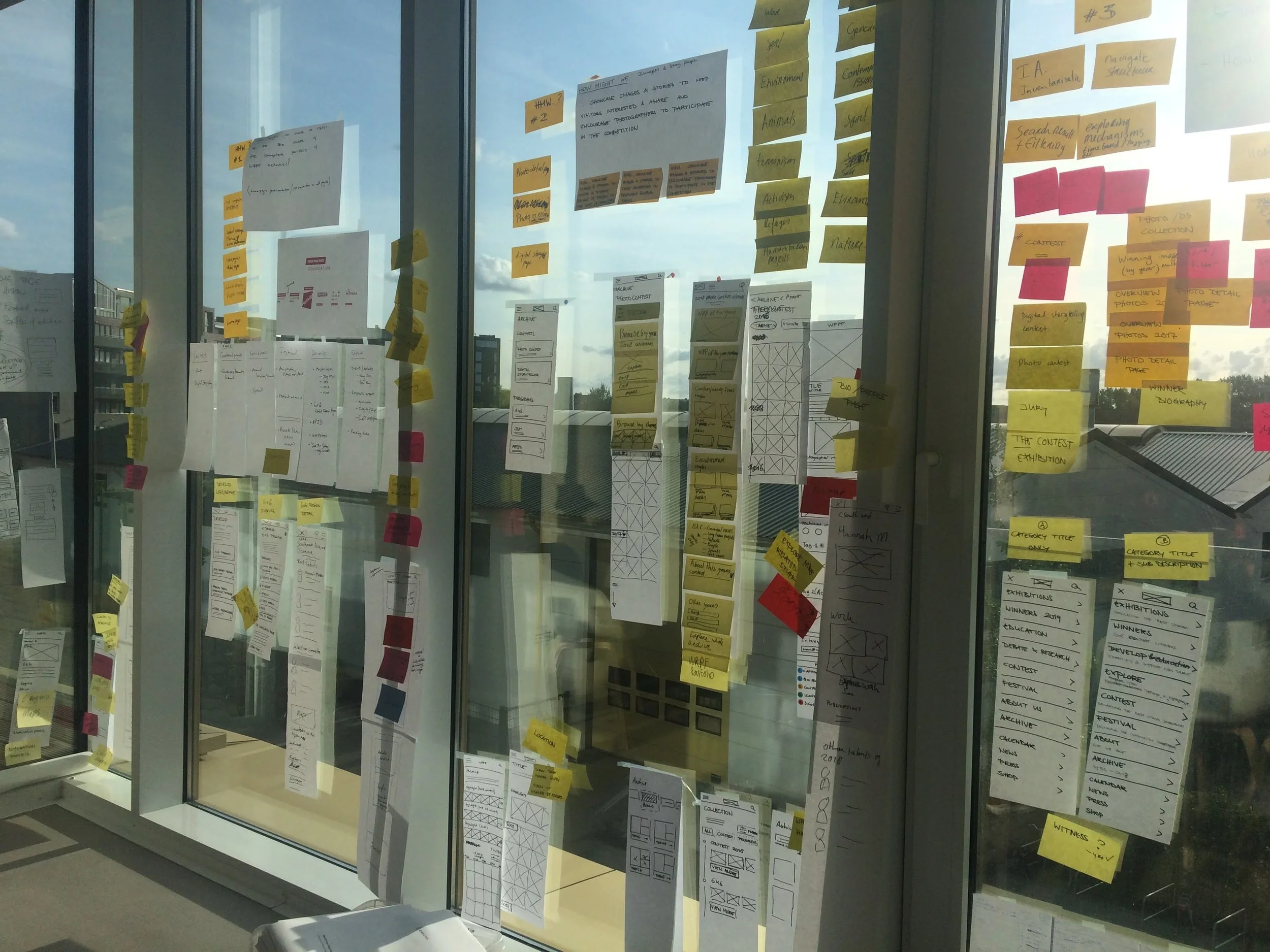

Insights from the design sprint.
First tested hi-fidelity prototype from the design sprint.
+ Users understand the navigation.
+ Users find the archive easy to navigate.
- Too much text to read in some pages.
With all that, we started design pairing.
Wait, design pairing?
Yes, this is how.
Product (me) and UX specialist ideate-validate-iterate together.
UX creates the final architecture, journey maps and main interaction principles.
Product creates the interaction design and hi-fidelity prototypes for all flows.
Our key strategic pillars.
1. Exciting to explore, easy to use.
New documentary photography showcase focusing on different kinds of storytelling.
2. Personalisation.
Display events in the local area, contests to professional photographers, etc.
3. Archives, simplified.
To display all the “Photos of the Year” since beginning of contest.


Design language: The power of an image.
Good balance between UI and the photos using open layouts and simple design elements.

Thank you, Google for your material design color use guidelines!

Color system for surfaces: Background and cards.

Primary brand color scheme.

Design language.
Type
Main UI font: Akkurat.
Akkurat is a grotesque sans-serif typeface designed by Swiss designer Laurenz Brunner and released in 2004.
Design language.
Simple, modern, friendly, and sometimes quirky.
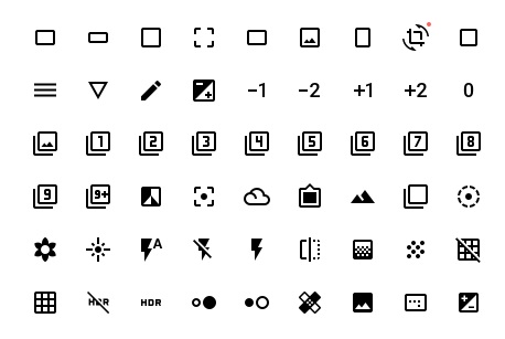
Each icon is reduced to its minimal form, expressing essential characteristics. They have a symmetrical and consistent look, ensuring readability and clarity, even at small sizes.