Smart medical devices B2C
Discover ways to enable yourself to live a more fulfilling life. Keep a healthier heart and respiratory system using health lifestyle devices.
Team.
Lead Product designer (me), Strategist, Product owner, Project manager, Business analyst, Architect, Tech Lead, Lead UX, UX researcher, UX/UI designers, Content manager, Content creators & Copywriter.
The project started with six weeks of extensive strategy work.
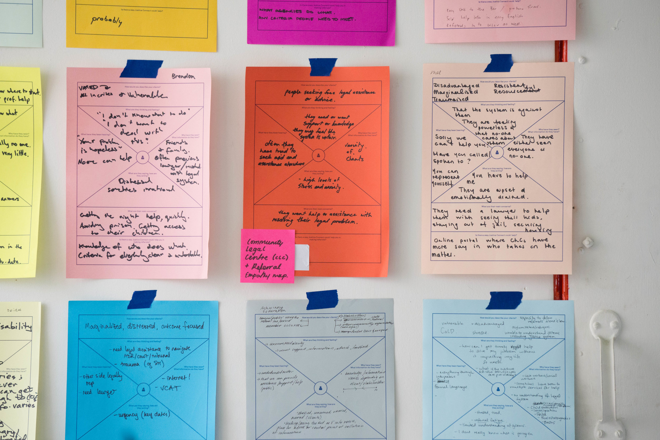
15 workshops.
Research with real customers.
Definition of 4 customer journeys.
UX/UI prototypes.
Complete system architecture.


The goal was to become the leading direct seller of healthcare devices.


Insights from this phase.
Our key strategic pillars.
True expert premium support.
Help the customers in every step of the journey and suggest the perfect product that matches their individual needs.
Capture and convert.
Target the right audiences and implement services and persuasion techniques to get customers to buy.
Guidance for a healthy life.
Build a lasting relationship with consumers by normalising our healthcare products, offering education and inspirational lifestyle content.
Insights from the design sprint.
First prototype ready for UX Lab!
+ Quality perception: Customers noticed the quality of products.
+ Brand experience: Customers found the brand trustworthy and their advice was interpreted as “expert level”.
- Entry points: Users weren’t directly looking for a solution but to identify if they had a health problem.
- Content: Facts and figures weren’t interesting. Users preferred solution driven content.


With all that, I started designing in a scrum team.
Our guiding design principles:
Healthy, positive, lively, personal and empowering.
Design language.
Clean interface (look) with lively (feel) design elements to communicate clearly and with a human/friendly touch.
Technological with a lifestyle and humanistic perspective (empathy).

Design language.
Color.
Exploration of the brand colors to evaluate its rol in the interface design.


Monochromatic lively colour schemes to structure the way colour is used in the interface.
Derived from a single base hue and extended using its shades, tones and tints.

Design language.
Type.
Brand font: Proxima nova
Proxima Nova bridges the gap between typefaces like Futura and Akzidenz Grotesk. The result is a hybrid that combines modern proportions with a geometric appearance.


Design language.
Simple and hands-on UI.
Clean layout and lively design elements to communicate clearly and with a friendly touch.


Design language.
Illustrated UI for themes and how-to-use.
Easy to relate metaphors. The style is full of life, uncomplicated, active and outgoing.


Design language.
Capturing the brand mood with curated photography.
The hero is the customer placed in a recognisable context that relates to a situation (moment in life), relationship (interaction with others) or emotion (feelings).


