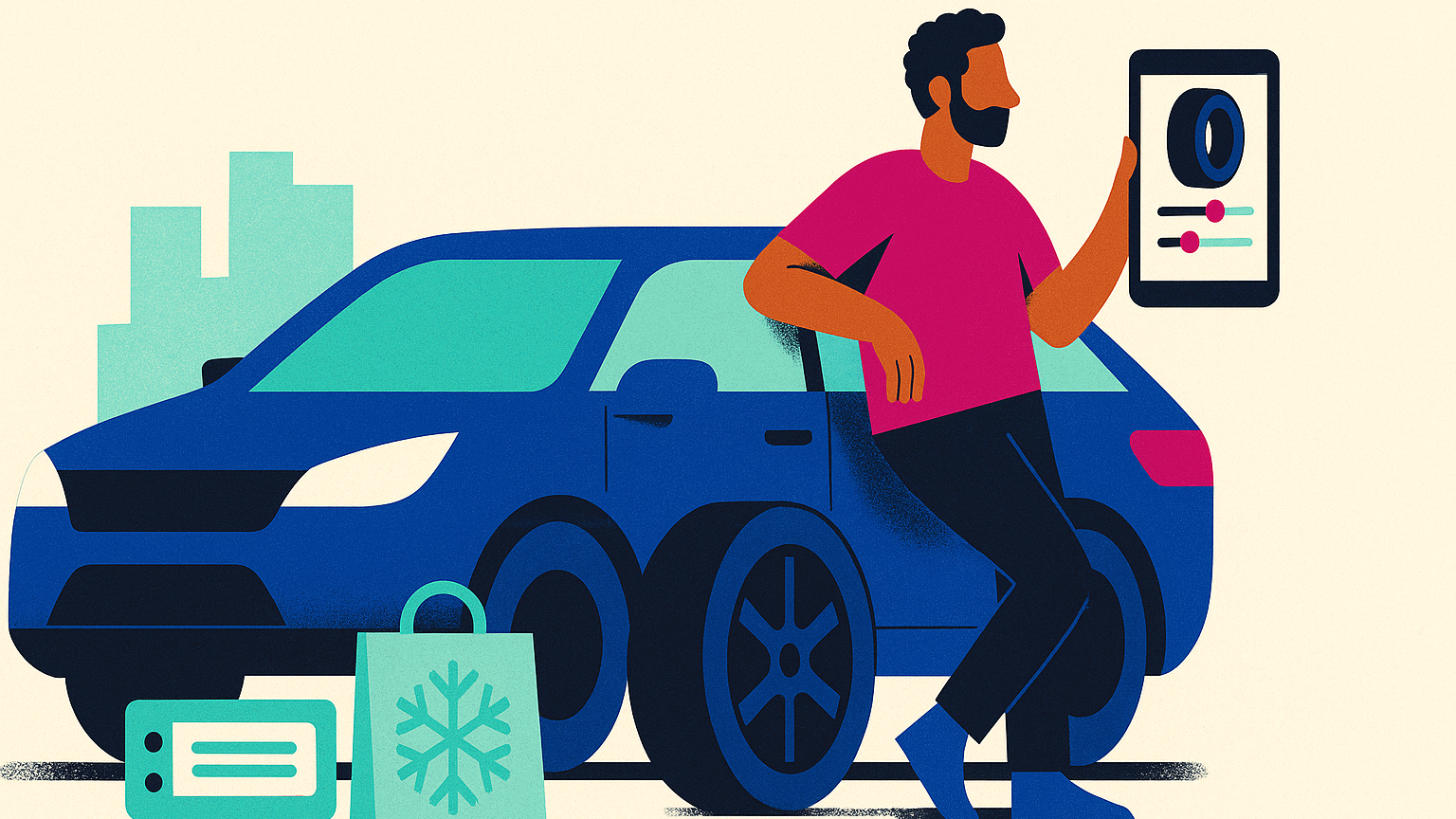
BandenConcurrent
Designing confidence into a price-driven market
When I joined BandenConcurrent, I stepped into a category where everything looks the same: rows of black circles, subtle spec differences, and a checkout that feels high-stakes.
Buy the wrong size and you don’t just waste money, you risk safety. The business needed growth; customers needed clarity. My mandate as Lead Product Designer is simple to say and hard to do: make tire shopping feel guided, honest, fast and without dumbing it down or eroding margin.
Status: This redesign is currently in development. A live preview will roll out soon. If you’d like an early walkthrough or artifact set, contact me for a short call and I’ll demo the flows and decisions.
The shift we made up until now
The breakthrough wasn’t a single screen; it was a change in posture. We moved from “browse our catalog” to “we’ll help you decide.” That shows up in three moments:
At the start, we redesigned the on-ramp so people can begin by license plate, by tire size, or by season, three mental models that reflect how real drivers think. Instead of pushing everyone down one path, the site meets you where you are and nudges you forward with plain-language cues.
At the point of doubt, the product page no longer asks for blind trust. We added Prijsverloop, a price-history view with a human verdict “Good Deal, Average, or Not a Good Deal” and guidance on what to do next. If it’s an average moment, you can watch and wait. If it’s not a good deal, we present close alternatives and explain why they’re comparable. It’s transparency that keeps people in the conversation.
When things go wrong, like an out-of-stock item, an on-site assistant named Tim proposes compatible options and tells you why they fit. It feels like help from a clerk who knows the aisle by heart, not a pop-up pushing the most expensive substitute.
Each of these is a tiny promise kept: we’ll lower your cognitive load, translate jargon into outcomes, and respect your budget.
My role
I lead the product design across strategy and craft: framing the problem with leadership, shaping the experience architecture, writing the diagnostic language, and partnering with engineering and analytics to make it measurable. I ran research (unmoderated comprehension checks to tune cards; moderated walkthroughs to observe hesitation around license plates and privacy), then turned the insights into a roadmap that shipped in phases rather than “big bang.”
I also pushed for ethical clarity. When advertising ideas surfaced that could compromise trust, I documented the risks and proposed a clearly labeled promotions model separate from organic ranking. We kept revenue opportunities and integrity in the same room and, let the experience stay honest.

Value to the business
This work isn’t about pretty UI; it’s about confidence as a conversion lever. By removing decision anxiety at key moments, we created momentum: more successful entries into the product list; more decisive clicks from list to detail; more carts started from “Good Deal” states; and fewer dead-end sessions when stock shifts.
Even before long-run A/Bs conclude, you can feel it in support tickets and session replays: fewer “is this the right tire?” panics, more “ok, that makes sense” moments.
How I work
Start with emotions, not components. I map where fear and friction live, then design interventions that restore agency.
Tell the truth beautifully. Diagnostics like Prijsverloop don’t manipulate and they explain trade-offs with respect.
Instrument everything. If it matters, it emits an event. If it emits an event, we can learn and iterate.
Lead across the aisle. I translate between engineering constraints, marketing goals, and what customers actually need.